Explore communities and create personalized travel plans

As part of a design course at the University of Michigan, me and four other students were tasked with creating an app to remind people to express gratitude. We discussed several apps that we enjoy using, including several travel apps, and collectively came to the realization that oftentimes there are many hidden gems to explore within one's own community that go unnoticed. With this realization, we built GEMS, an app for finding exciting places in your own backyard.
It is difficult for people to connect with their surroundings and their community, and show gratitude towards the hidden gems and places worth visiting right in their own backyard. This is an interaction design problem because other applications, such as Yelp or Airbnb, require a lot of time, research, and (usually) some amount of money to enjoy the experiences these services are offering. It can be frustrating for individuals to try and find things within their community to explore when they have low amounts of time or technological literacy.
An app with functionality for automatically creating travel plans so that people spend less time researching and more time exploring hidden gems.
Competitive Analysis was done in two stages. First our team analyzed Yelp and Airbnb, two direct competitors of our platform. These are a few things that we noted as things to consider when making our platform.
Next, our team analyzed Instagram and Netflix. Although these are not direct competitors of our platform, we wanted to determine what features we liked from these apps that may be beneficial to our AI-based travel app. These apps would be considered "analogous" competitors as they provide inspiration for and impact people's expectations of our product.
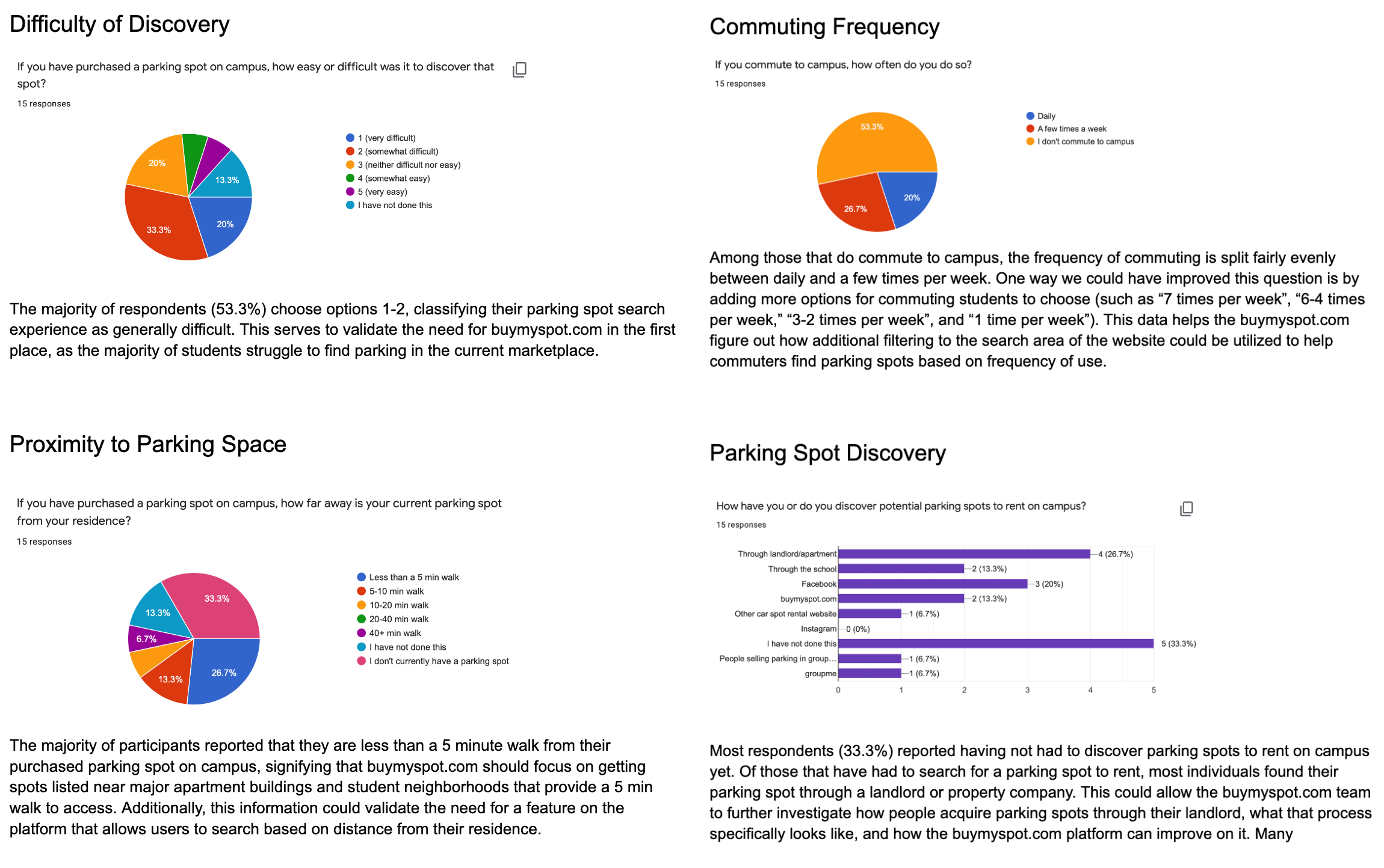
To gather more information and determine pain-points of potential users, the team interviewed 10 potential users from our design's target domain. Each member interviewed 2-3 people for roughly 10-15 minutes and took very detailed notes, which were qualitatively analyzed. The 3 main takeaways were:
“I've been dealing with parking all week as we've been getting a lot of phone calls from people wondering if we have spots available for them to rent out.”
Interviewee, 51, Female
"We have two different types of spots available in our lot: covered spots which go for $190 / month and uncovered spots which go for $170 / month"
Parking Lot Owner, 64, Male
“We right now just keep all of the information on parking availability on a Google Sheet... There are often a few spots that go unsold by the time the semester starts.”
Interviewee, 30, Female
“The amount of websites out there is a bit overwhelming - I wish it was all in one place, especially because oftentimes I'm looking for something very specific.”
Interviewee, 55, Male
"Sometimes NextDoor and Facebook posts will pop up with cool things to do - people post about things going on and that generates interest."
Interviewee, 55, Female
“The problem with a lot of these other websites is that they are full of ads and I need to fill out a bunch of forms to get to the information that I want.”
Interviewee, 55, Male
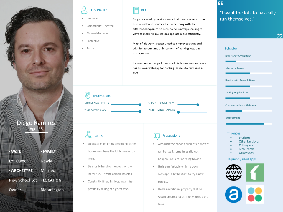
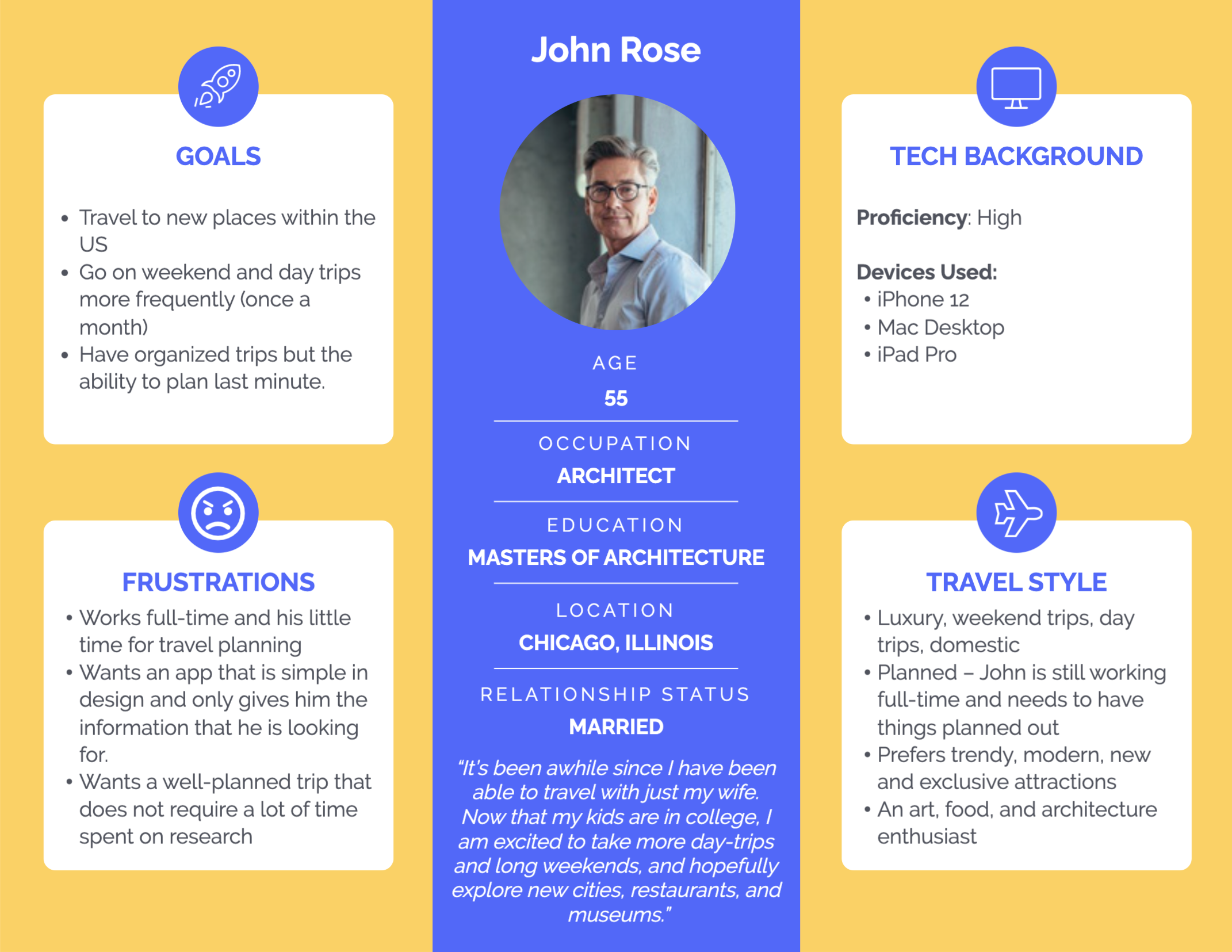
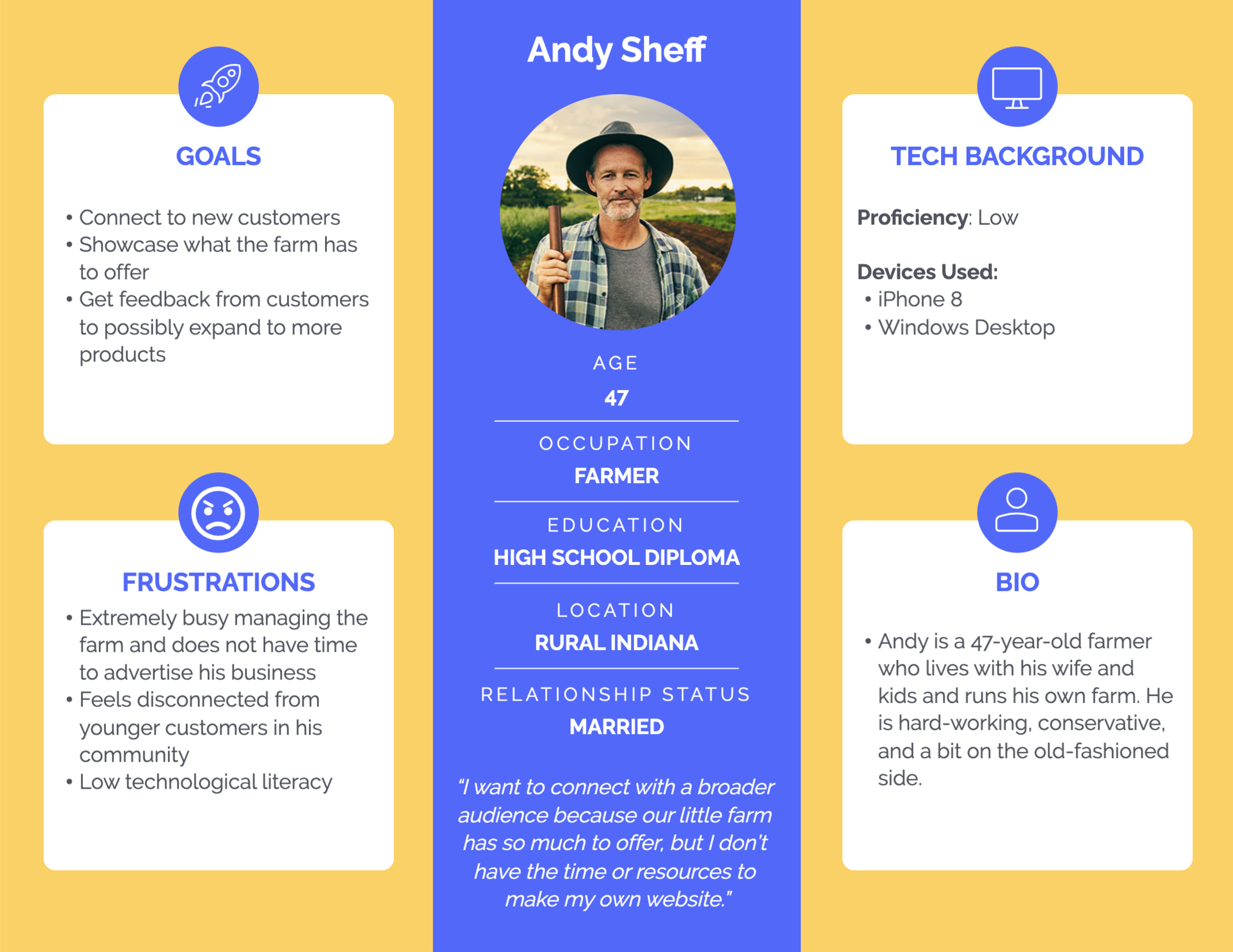
Next, we created 2 primary personas and 2 secondary personas based on our interview data. These personas reflected the two types of users we would anticipate to be using our app: travelers and hosts.
.png)
To further explore and understand our target users, our team sketched several storyboards to complement the personas that we created. The goal when creating these storyboards was to bring realistic detail to these people and allow us to connect and learn about the user’s activities, lifestyle, frustrations, and goals, which in turn will improve the development of our app.

To address our user's pain-points, our team contrived several key decisions that would guide the creation of our app.
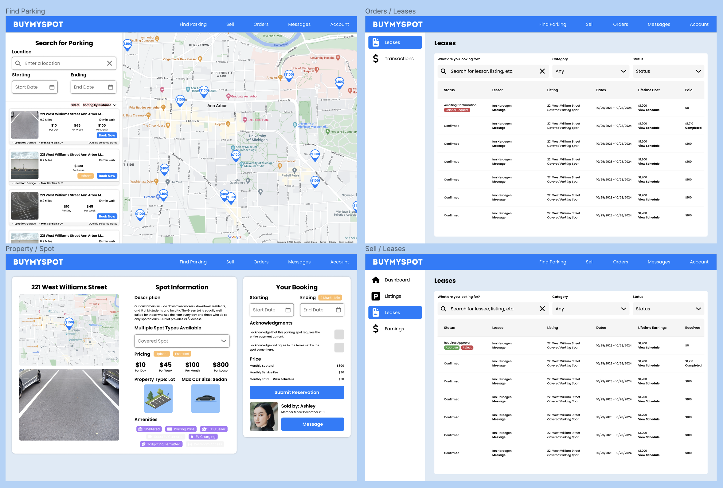
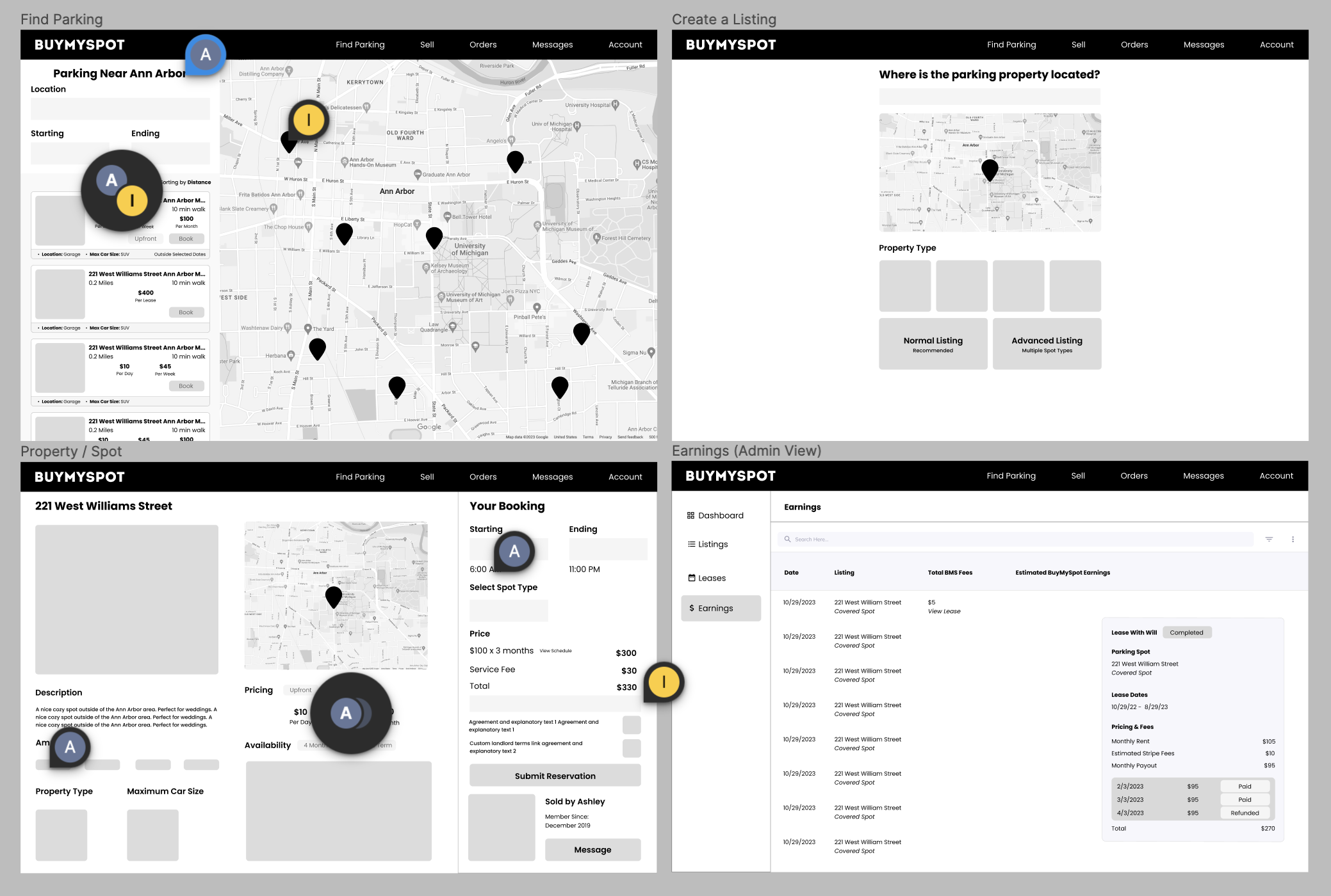
This feature allows buyers and sellers of parking spots to communicate directly within the platform, making it easy to arrange details of the transaction and answer any questions they may have regarding pricing, location, etc.
Landlords and lot owners need to be able to easily manage and sell parking spots of different types at multiple properties, with customizable options like format of payment (monthly or upfront), minimum lease ranges, and custom lease agreements.
This feature provides a clear overview of all leases and transactions on the platform, allowing landlords to easily sort and filter data to view the information they need, such as current and past leases, payment history, and more.
In order to reduce information overload on the app, two types of accounts were created: "travelers"- those who are exploring their communities and creating travel plans, and "hosts" - those who are hosting events in their communities.
Users are often overwhelmed by vast amounts of information on other travel websites, and would benefit from a tool that automatically suggests plans based on their preferences. A "travel personality quiz" was designed for creating plans.
Our interviewees mentioned that they often are looking to do things with friends or family but struggle to make plans together. Our app allows for creation of groups where users can easily create plans together by syncing their travel quiz results.
A user flow diagram was made to show how users will be interacting with our app.
.jpg)

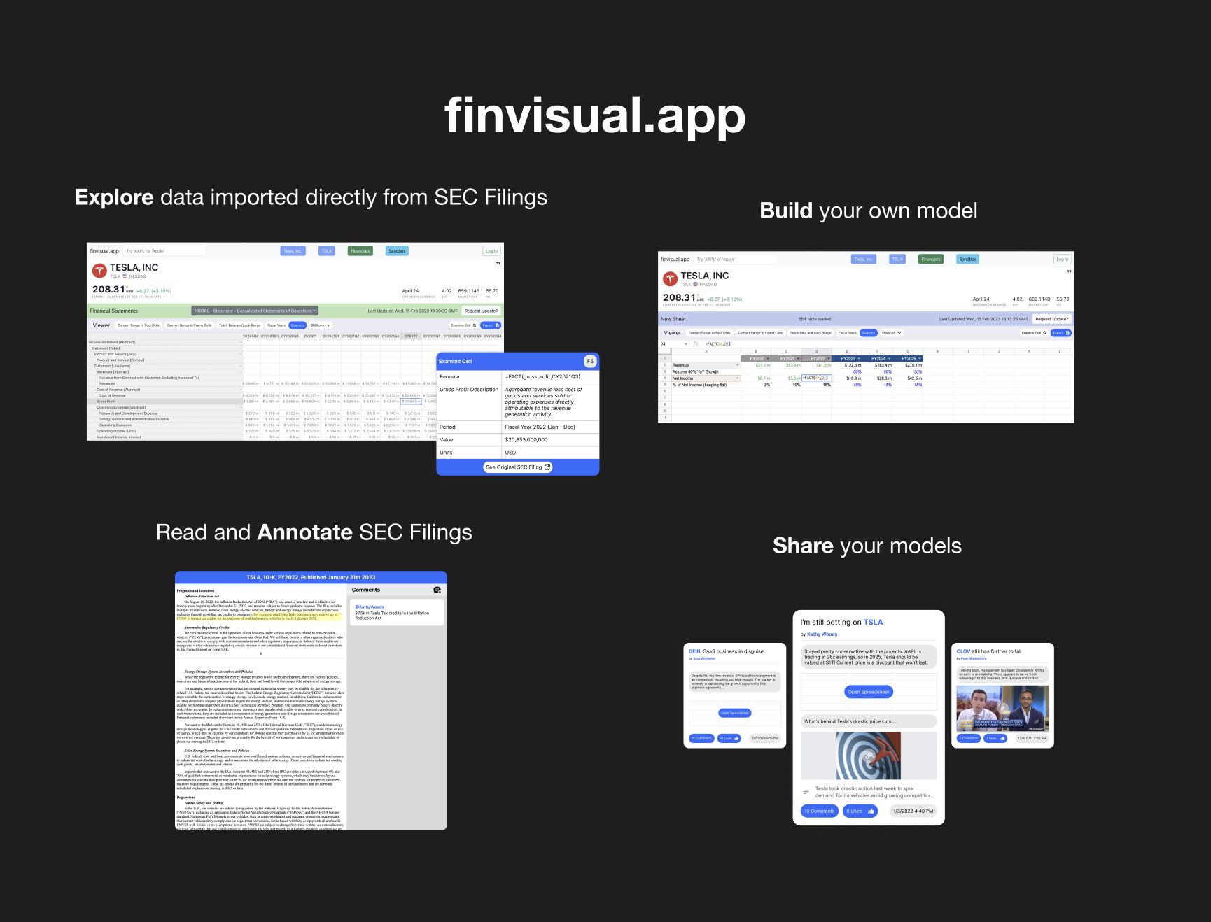
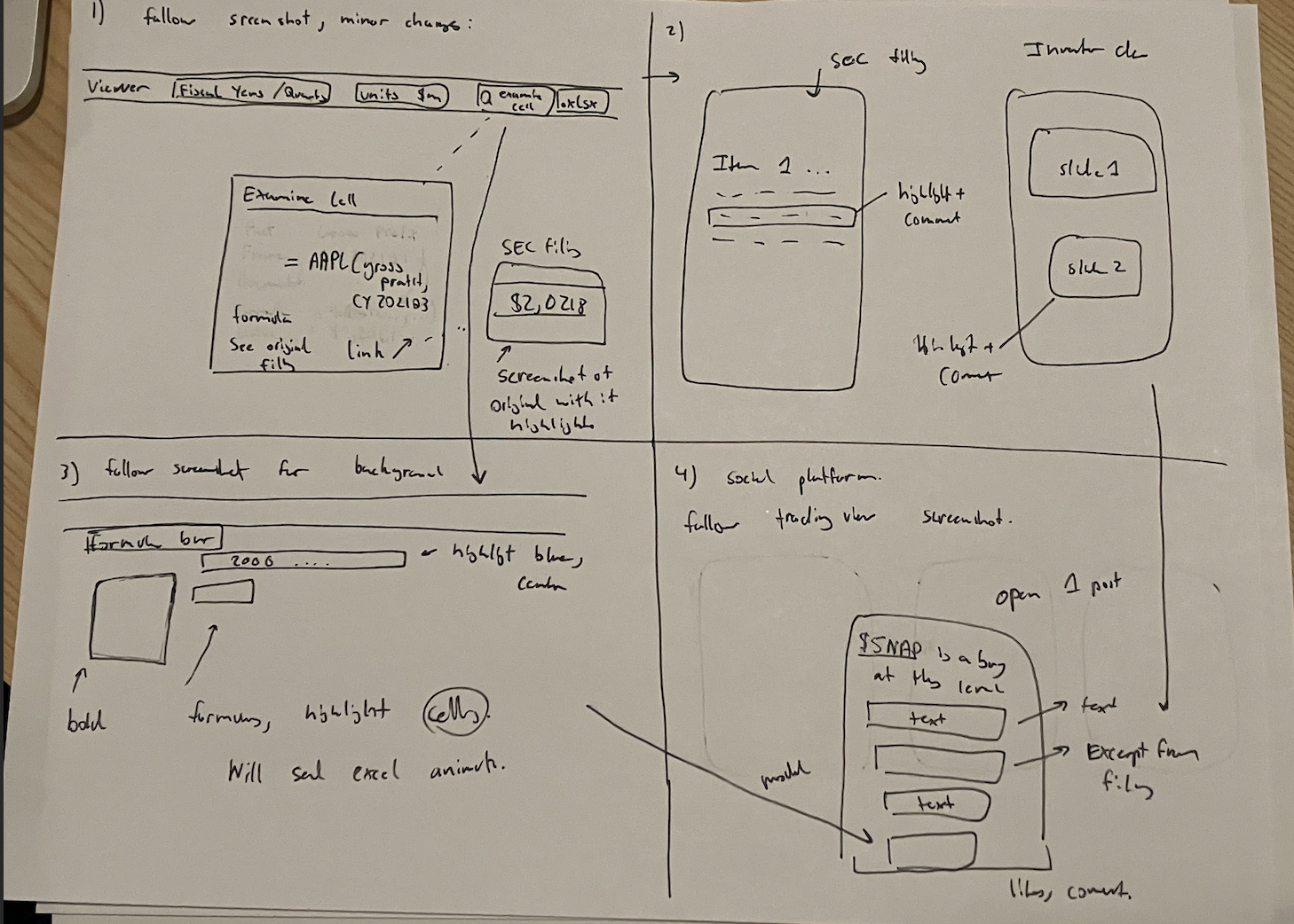
The founder explained that the idea for FinVisual came from the frustration of seeing investors and traders resort to screenshotting SEC filings and sharing them on social media platforms like Twitter and Reddit. While these platforms can be helpful for sharing ideas and discussing investments, there are several paint points faced on these platforms.
Many individual investors lack access to the same financial data that professional traders and analysts have. This can make it difficult for them to make informed investment decisions and stay on top of market trends.
Even if investors do have access to financial data, finding information they need can be time-consuming. This can be challenging for casual investors who don't have time or expertise to sift through complex financial reports.
Once investors have gathered financial data, analyzing it and making sense of it can be a challenge. Without the right tools , investors may struggle to identify trends or make accurate predictions about the market.
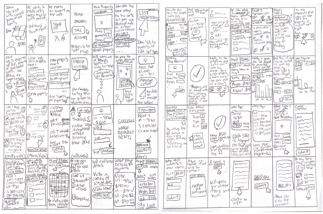
Each member of our group drew 3-5 interactions for a paper prototype.These were organized into a recording.
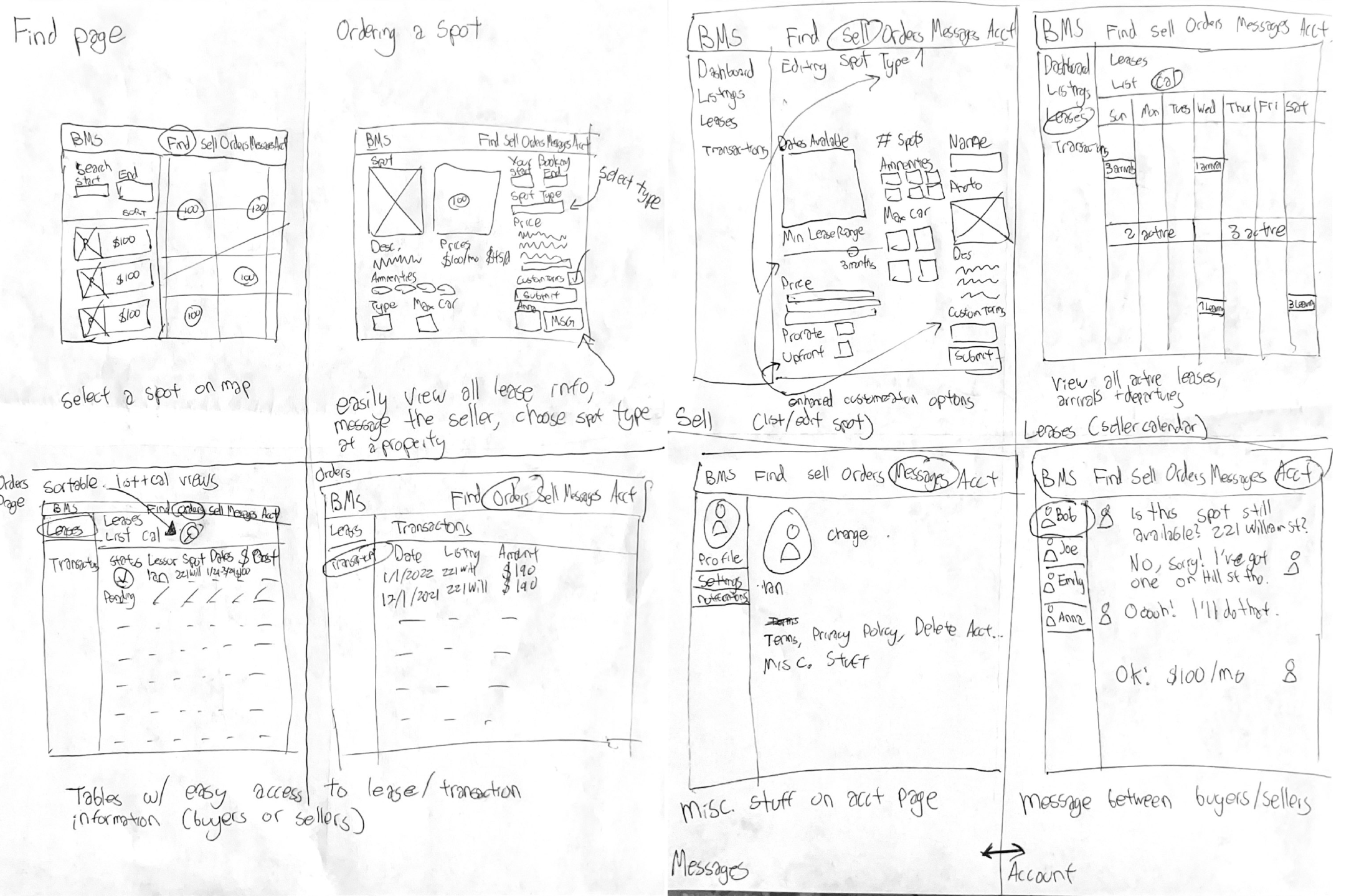
Next, we took our designs digital and built wireframes, improving upon our paper prototypes.

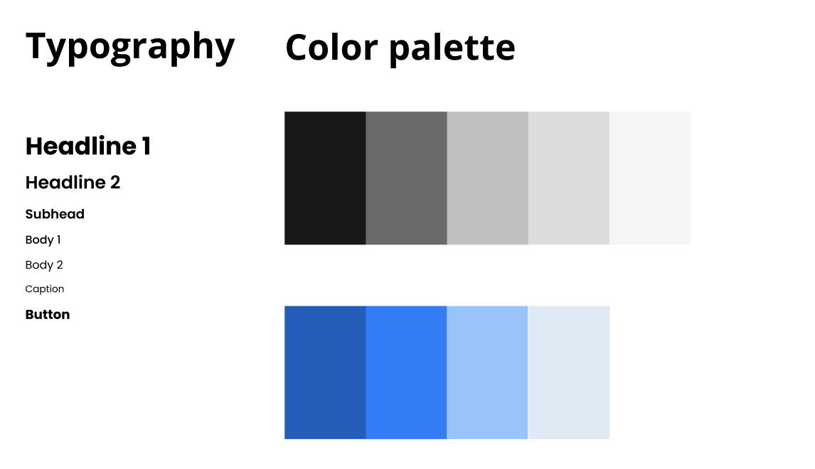
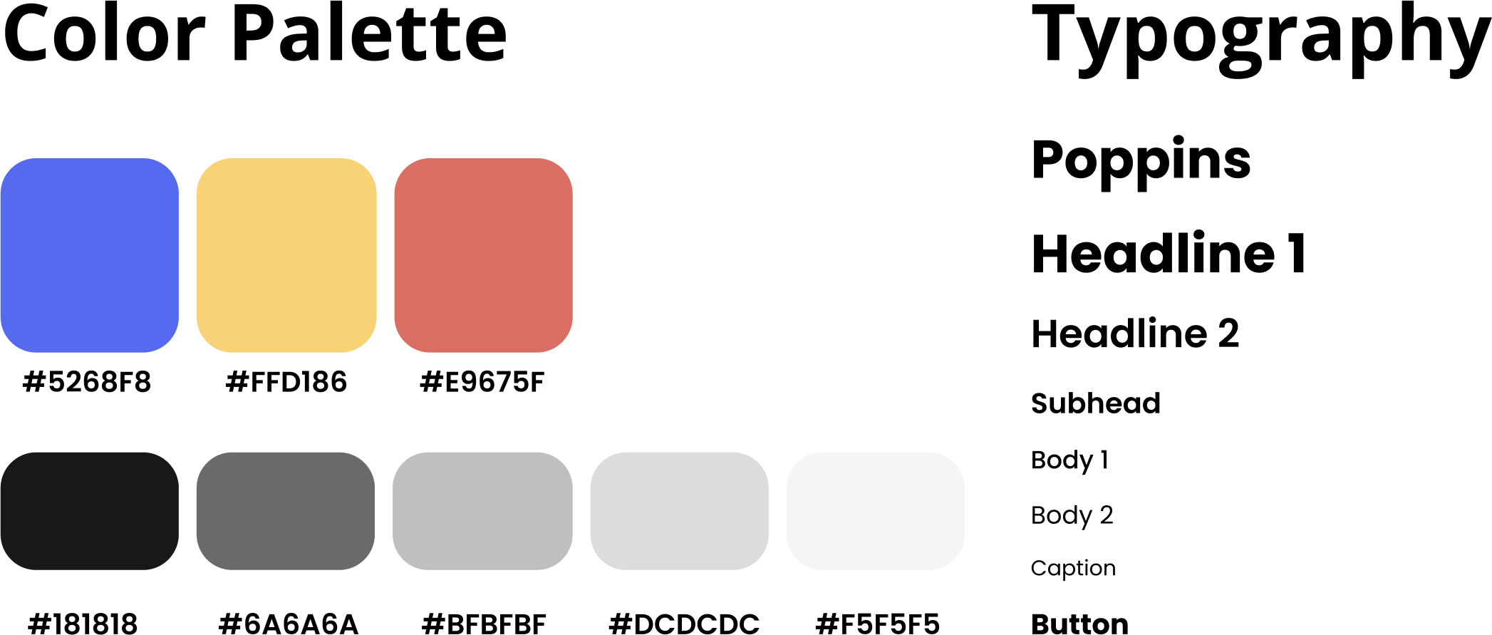
To prepare for our digital prototypes, a playful color scheme and font was selected.
For our Mid-Fi Prototype, we continued to improve upon the product's visuals and implemented interactions for the main screens of our product. The ability to click through and navigate pages helped our understanding as designers on how to connect processes in our app.
Our final product! We revised several features of our design based on usability tests performed in class as well as created the "Host" screens of the app. View Final Product.